blink website

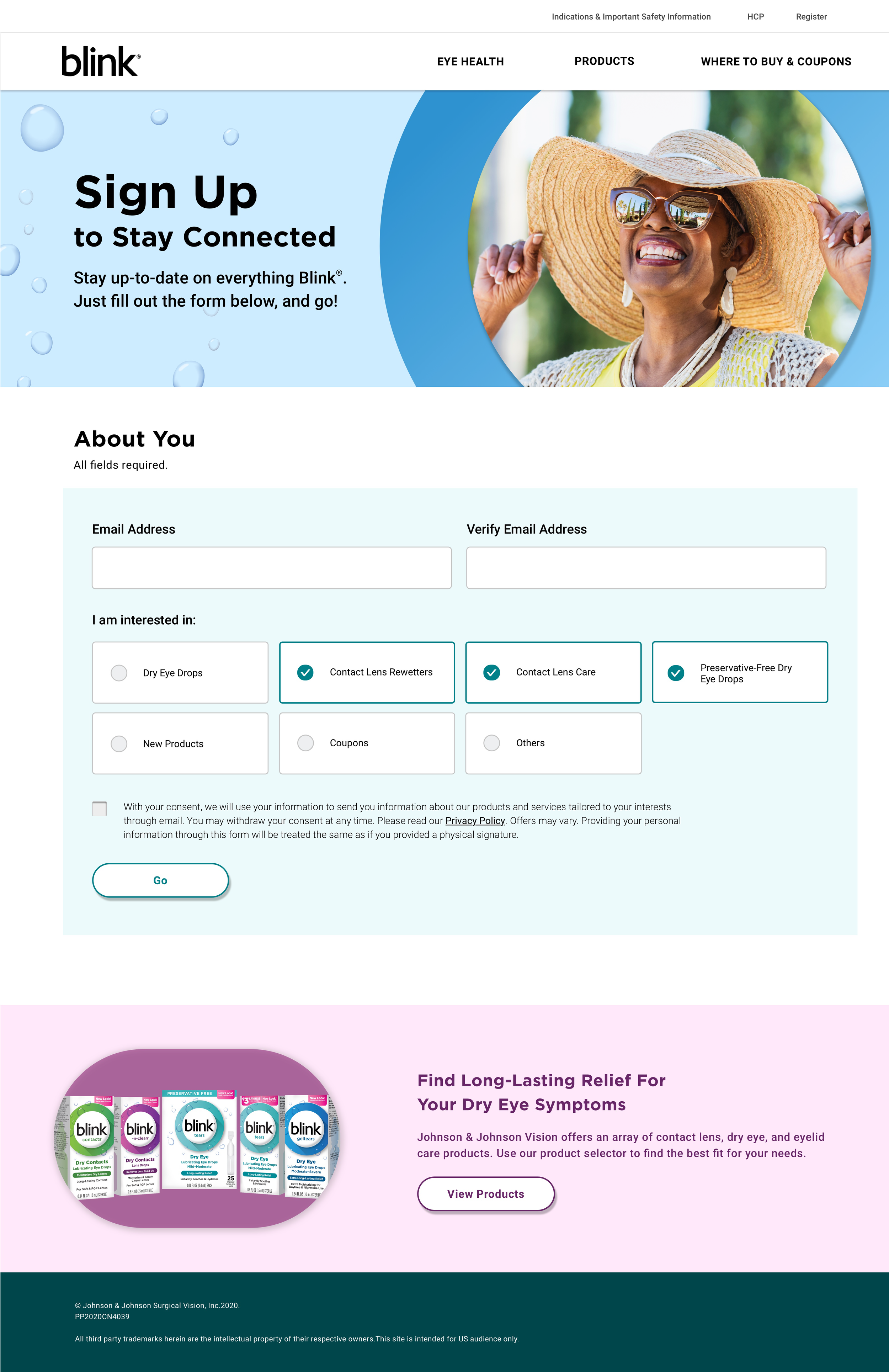
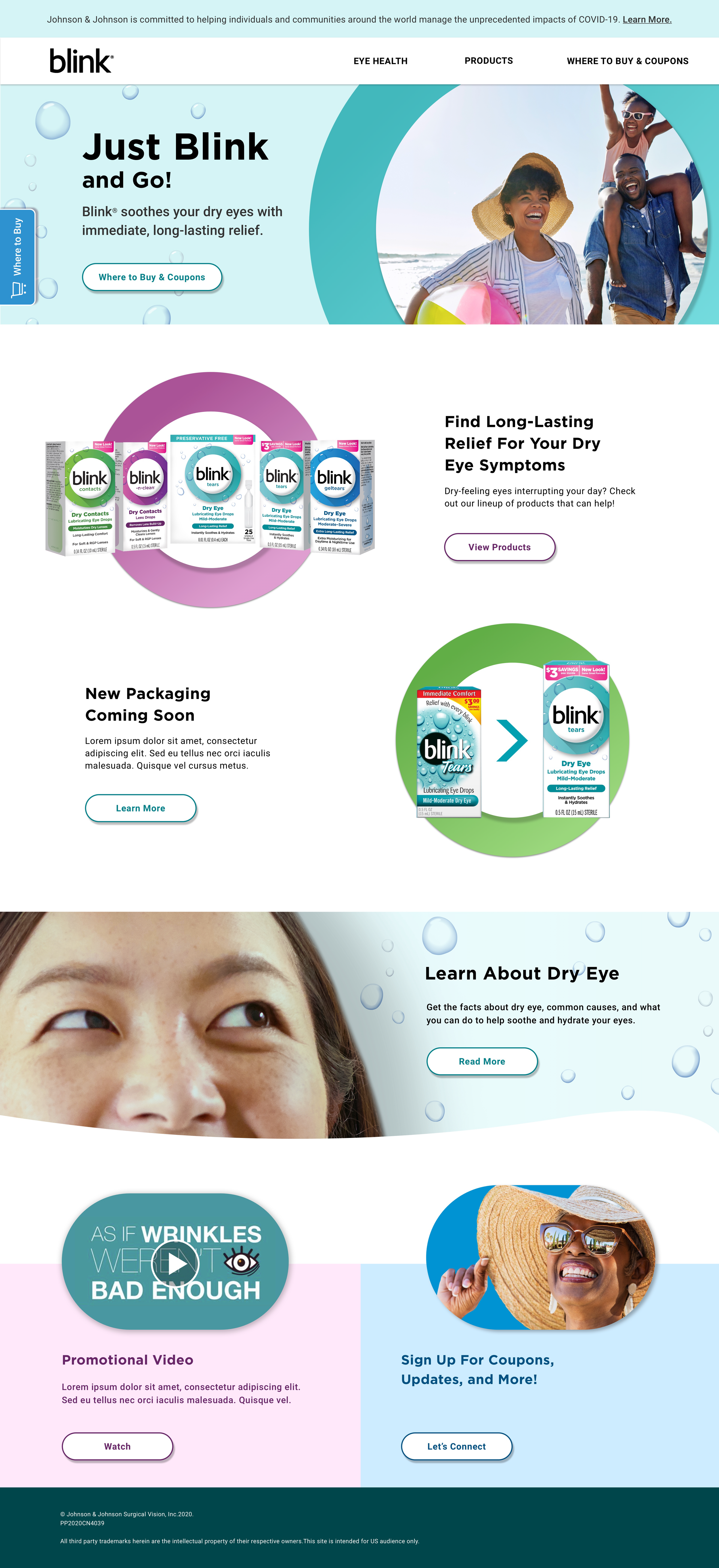
When blink eyecare products got a packaging makeover, they wanted a whole new website that combined product information, patient education, and e-commerce in one simple, seamless experience.

MY ROLES
UX Copywriter | Copywriter |Content strategy

THE CHALLENGE

To create a website that showcased the right balance of product information and patient education while giving users a simple way to get the eye care products they need.


THE APPROACH

A key part of the process was deciding whether to lead with product information or patient education. We went back and forth discussing the fact that someone needs to understand the condition they’re dealing with in order to know how to help treat it, but also recognizing that many visitors to the site would simply be ready to buy — and we didn’t want to prevent any road blocks to those users.

Ultimately, we decided to lead with product, but also included patient education in contextually relevant areas of the site to show Blink’s expertise in the world of dry eyes and give instant reassurance as to why certain products made sense for certain conditions.

CONSIDERATIONS

This site included general copy, product copy, product filters, and a product locator feature. In writing all, I had to keep in mind the fact that while dry eyes isn’t considered a serious medical condition, it’s still considered a medical condition. I had to find a way to project Blink’s light-hearted brand voice while creating a tone that inspired trust and confidence — talking to, not at site visitors and making them feel confident that their choice of product would make their lives easier.